Short answer: not always. 3D earns its place on a luxury website when it shows something a photograph can't. When a render looks even slightly less real than the product, great photography sells better and loads faster.
I run a studio that builds 3D websites, and on one of my favourite projects the best decision I made was to remove the 3D. The project is SADAF, House of Pearls, a concept build for a heritage pearl house. Here is what happened, and the four questions I now ask before putting 3D on any page.
What did the 3D version of SADAF look like?
The first draft looked the way you would expect from a 3D studio. Dark backgrounds, with the whole page built around WebGL. It had the drama. On a portfolio reel, it would have looked impressive.
But I kept looking at the pearls.
A website can say a lot about a jewel. "Not quite real" is the one thing it can't afford to say.
Why did the 3D not work for pearls?
Pearls are hard to render. Their whole appeal is a soft glow that sits just under the surface, and small flaws that tell you they are real. Every generated render I tried looked slightly plastic. Close, but not quite real.
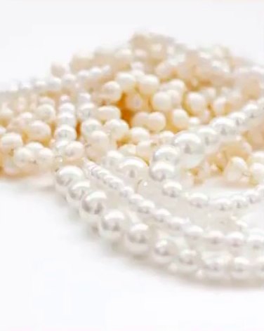 Photograph
With jewellery, "not quite real" is the worst thing a website can say. A customer about to spend real money on a real object starts to wonder what else is not quite real.
What replaced the 3D?
I rebuilt the site around editorial photography. The new direction:
- Warm ivory backgrounds and near-black type, so the page feels like a printed lookbook rather than a screen.
- Rose and antique gold kept for small accents, never large areas. Colour is a seasoning here.
- A story told in order: the opening image, then collections, a featured piece, craftsmanship, a heritage timeline, questions, and finally an invitation to visit.
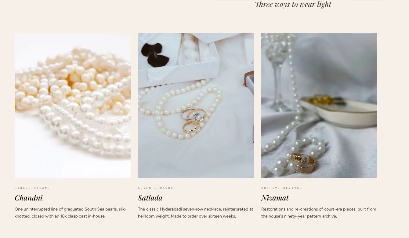
The motion stayed, but it changed jobs. Instead of showing off the technology, it now paces the reading: things settle into place as you scroll, the way you would turn pages in a catalogue.

Did removing the 3D make the site faster?
Yes. The first load of the finished site is 159 kB.
159 kB
First load of the finished SADAF site
That number is not luck. Smooth scrolling only loads after the page is ready to use, so it never delays the first view. Every animation respects the reduced-motion setting on the visitor's phone or computer. A heritage brand's customers are often not on the newest phone with the fastest connection, and the site should feel just as calm for them.
When is 3D worth it on a luxury website?
None of this means 3D is a gimmick. On Uma Jewellers, a Hyderabad gold and diamond house, the hero is a ring rendered live in 3D, and I kept it. The difference is what each product needs.
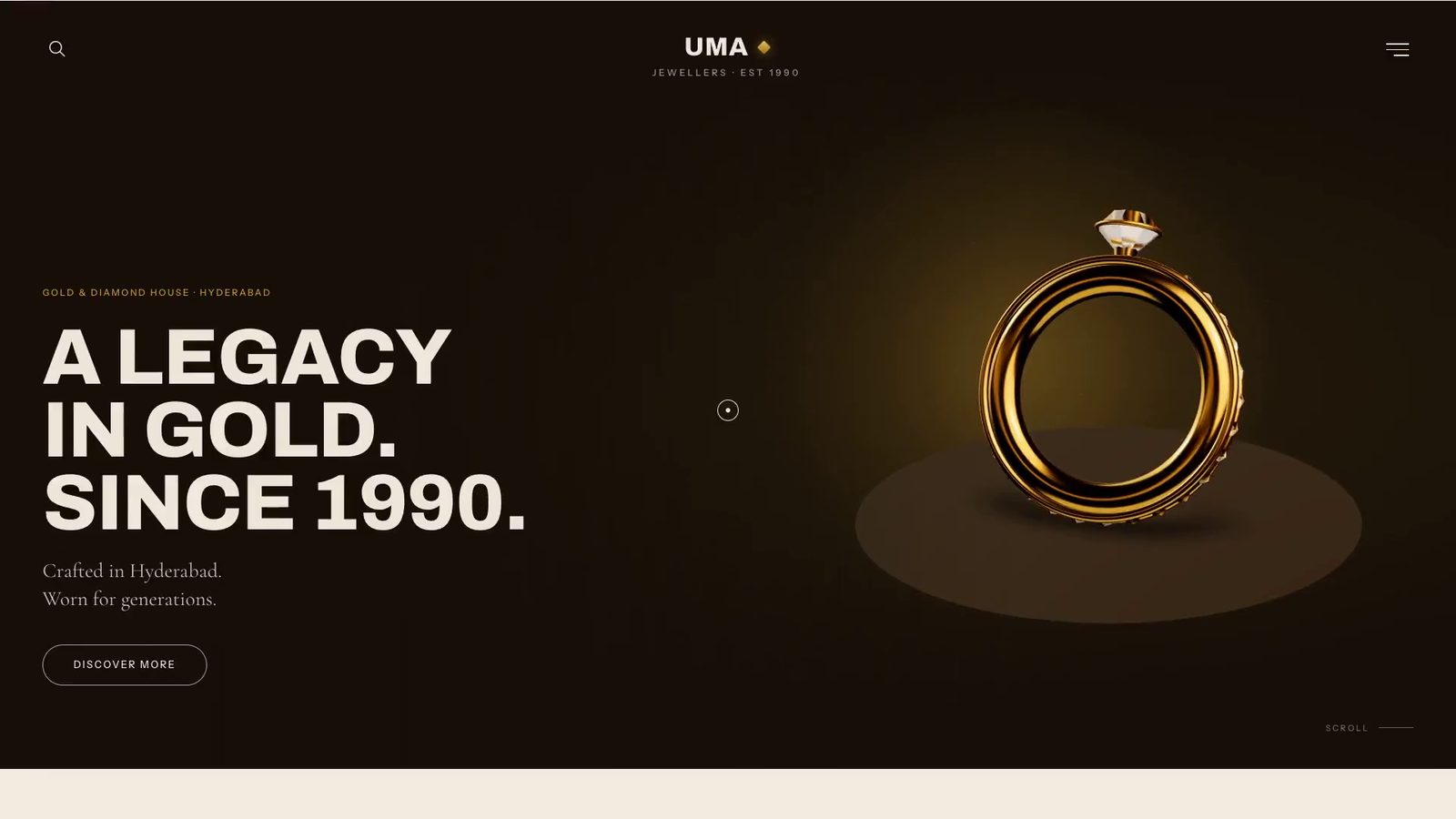
These are the four questions I ask before putting 3D on a page:
- Does the 3D show something a photo can't? A ring you can turn reveals how the stone is set. A pearl in a render reveals nothing a good photograph doesn't show better.
- Can it look real enough? If the render looks even slightly fake next to the real object, use the real object.
- Does it help someone decide? 3D that helps a customer understand the product is working. 3D that only says "look what we can do" is working for the studio, not the brand.
- Is it worth its weight on a phone? Every effect costs loading time and battery. The page has to stay fast on mobile data.
If the answer to any of these is no, the honest move is to cut it, even when it was the most fun part to build.
What should you ask a studio before you commit to 3D?
The question is not "can we add 3D?" It is "what does our product need people to feel, and what is the most believable way to show it?"
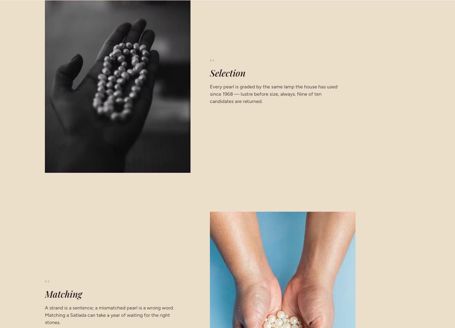
Sometimes the answer is a live 3D object. Often it is great photography, good type and motion that knows when to stay quiet. A good studio should be willing to tell you which one, even when the answer is the less flashy one.
See the finished SADAF case study or browse all my work. If you are weighing up 3D for your own brand, tell me about the project and I will give you a straight answer on whether it is worth it.